February 23, 2012

Naturally.....

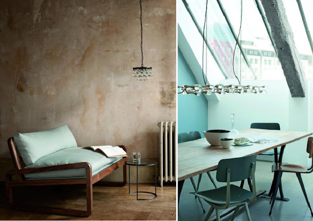
I'm so affected by these photos created by the photographer Mikkel Adsbøl (again - I can't stop staring at his vignettes) they have such a natural romance about them.  But I had the urge to bring in my favorite bag, this season's Mulberry Messenger Bag - inspired by my darling sister (in-law)'s blog Styles by Ola who just posted Mulberry's a/w collection highlighting some of the best of London fashion week.   


Fritz Hansen, Gubi and Fredericia Furniture all feature a fresh look at wood in their latest collections. With a Scandinavian authenticity they remind us of all its endless variations - never failing to inspire.  Photos by Yellows.

February 22, 2012

Rustic meets Contemporary.....

I have gathered a few key pieces together from ABC Home and Restoration Hardware, with ideas on how to reinvent some of the classics into a contemporary interior.  I think I'm naturally drawn to blues and find some romance in Chinese blue porcelain pieces and dark teak furniture from the East, especially those inlaid with mother-of-pearl.  I don't doubt that has something to do with my mom who gathered keepsakes from her travels around the world and somehow they always seemed so stylish, fitting together seamlessly and altogether telling a story.


The images above are brought together from House Beautiful magazine and vignettes by the great lifestyle photographer, Mikkel Adsbøl.


Naturally, I'd like to buy just about everything from both of these fabulous shops, but for now here are some pieces that bring so much character to any space.....

ABC Carpet & Home: Aquasilk Carpet, Mother of Pearl Chest - Charcoal, Edge Writing Desk, Edge Night Stand, Silk Cushions - Flora & Fauna.

Restoration Hardware: Chandliers (Foucault's Orb Crystal Chandelier, Casbah Crystal, & 19th Cent. French Empire), Peacock Mirror. 

February 21, 2012

Shades of Grey......

There are so many ways to enjoy grey.  It exudes a certain confidence, a certain understated elegance - whether introduced using soft textiles, wools, cashmeres or for a more industrial contrast with tarnished silver, chrome or stone - it references materials shown in their raw, unfinished state. The layers of different textures can create such an interesting space.  

The restaurant featured below is Kødbyen's Fiskebar in Copenhagen's meat-packing district.  It was one of the first projects I worked on in 2009 while working for the firm Space Architecture & Design.  An informal fish restaurant based out of a former slaughterhouse, the intent was to conserve the memory of the former building while creating a metropolitan bistro feel.  So, the old white tiles, meat hooks and heavy fridge doors were re-interpreted in eclectic ways and the bars were clad with old discarded door paneling from around the neighborhood. 

In an ad showcasing LIGHTYEARS' new Calabash pendant light - the restaurant was featured as a raw industrial backdrop to the curvaceous and iridescent silver surface of the clustered lamps.


I love the photos shown above, taken from the Danish magazine RUM by the photographer Yellow.

February 12, 2012

Modern Baroque

As promised, Joseph Dirand is back in this post featuring his design of this phenomenal home in the South of France - Le Mas des Oliviers en Ramatuelle.  Not far from St. Tropez it is an idyllic location - Dirand's interpretation is rustic luxury and is simply unmatched in my view.  I find his work and attention to detail compelling!!


There are many ways to capture a little of that glamour....here are some suggestions:


February 11, 2012

Balmain, ofcourse

Joseph Dirand's BALMAIN flagship shop in Paris.  Is there anything left to say? More on this great architect tomorrow.....


February 9, 2012

Great Nordic Styling...

Having lived and worked in Denmark for the past three years (not to mention being married to my very own Dane) - I can confirm the following: Scandinavians do effortless, relaxed and homely, so very well.  All along showcasing the best of high design - as it was meant to be - with authenticity and in a daily setting and without much hype.


The sophisticated and understated summer house shown in the first two photos collections, belongs to a couple of Copenhagen-ers, famous for their work in the fashion industry - Uffe Buchard & Kim Grenaa.  Their ability to combine items they have collected from around the world with mid-century classic furniture in a rustic and familiar way fits the simple open wooden house perfectly. The decorative elements are minimal but add texture to the overall warm neutral tones - and maintain a relatively organic yet masculine feel.  

Photographer Ditte Isager (also a Dane) did a series for the British product designer Ochre - some of which are featured above.  Ochre's lighting and furniture pieces are portrayed so effortlessly, it can almost make you forget all that goes into creating a mood that resonates and inspires.  Photographer Heidi Lerkenfeldt, is another whose pieces just make me smile - you can see one of her pieces in the 4th image (left).


February 7, 2012

Nostalgie...


I was completely taken by this idyllic chateau in the provence...Chateau de Moissac.  Photographed by Henri Del Omo, Bernard Touillon & Patrick Van Robaeys.  Restored in 2008, this 17th century home to a noble family from Provence looks over a small village perched on a rolling hill.  The essence of romance as it was meant to be. (www.chateaudemoissac.fr)


Introduced to me by the blog Afflante, the last two images are a series of sculptures by UNMASK, a group of three artists from Beijing.  There is so much silent emotion captured in their impressions....


I came across the book, Patina Style, on a friend of the author's blog, Lost in Arles.  It is on my list of must haves for it's authentic style ideas.

February 3, 2012

Just a touch of pink....


One of my favourite photographers Per Gunnarsson, gives such spirit to Daniel Bergman's interiors.  Effortless! www.pgfotograf.com 
Enjoy Ayadeena's hand-embroidered cushions from Jordan. Using textile patterns traditionally meant for dress-making, these brightly colored cotton pillows have given vocation to the women who make them.  An inspiring story and a beautiful collection! www.ayadeena.com

February 1, 2012

Classics Revisited

ADNET MIRROR BY GUBI / DCO9 CHAIR BY INODA+SVEJE / PITANGA
WISHBONE CHAIR BY CARL HANSEN & SON / COMBACK CHAIR BY PATRICIA URQUIOLA FOR KARTELL
PAPER TILES BY LOUISE BODY / ADNET MIRROR BY GUBI
Danish-Japanese design team Inoda + Sveje create the DC09 chair shown above in teak. Appearing to have been etched out by a master carpenter, it is almost delicate - and yet, stands discretely confident of the comfort it will provide and it's tactile appeal. 
The Adnet mirror designed by Jacques Adnet in 1950 in a collection for Hermes was reintroduced by Gubi this past fall. I love it's masculine statement and it's equestrian details. 
I was particularly caught by the Portuguese fashion brand, PITANGA's collection of photos harkening back to the playfulness of the 50's and 60's - in pastels - not to mention the eye-catching collections on their website. 
 There is something unashamedly naughty about the new colors the Wishbone chair has been introduced in, as well as, Patricia Urquiola's reinterpretation of the 1940's Windsor chair in bright glossy nail polish red. 
Louise Body's 'Paper' tiles have a depth and texture that creates for a very interesting accent wall (image thanks to Dear Designer's Blog!).